4 Ecommerce Site UX Problems That Are Killing Your Conversions (and How to Fix Them)


Your website can be a powerful one-stop-shop for all parts of the funnel—it’s a place for shoppers to learn about your brand, become more invested in your story, and eventually (hopefully) buy a product.
But even if your brand content is powerful and your web pages are beautiful, you could be losing out on sales due to simple UX problems.
We sat down with Rebecca Stickler of SEO agency WebpageFX to discover the common errors you may be making on your ecommerce site—and how to fix them so you can maximize sales.
First off, if your site isn’t mobile-responsive, it’s time to fix that.
“We’ve seen lots of traffic coming from tablets and mobile phones, and if your site isn’t responsive, you’re basically sending those customers to other competitor sites that are responsive,” points out Stickler.
Most ecommerce sites have made the switch to mobile-friendly sites, but there are a few stragglers. Some of those who are slow to adopt a mobile site strategy claim that the majority of their conversions come from desktop shoppers.
Well according to Stickler, that’s likely because you haven’t optimized your site properly for mobile, and it’s difficult to navigate.
WebpageFX did a responsive design for Wheeler Cat (a company that specializes in servicing, renting, and selling construction equipment) in June 2015. See the screenshot below with a comparison of conversions from 6 months before compared to 6 months after:
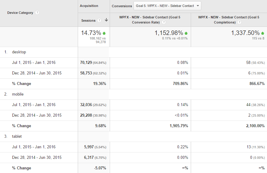
Their conversion rate had a huge jump site-wide, but the biggest difference was in their mobile conversions—from 2 to 44, a 2100% increase. The tablet results are pretty impressive too, considering the fact that they didn’t have any tablet conversions prior to switching to a responsive design.
Let’s say you’ve optimized your site for mobile, but you’re still losing customers right before or during checkout. As an ecommerce site, there’s one important thing that you may have forgotten to make mobile-friendly: checkout.
“If it’s a pain to make a purchase, then of course, sales wouldn’t be through that device,” says Stickler. “It’s important to A/B test [your checkout process] with different forms. Ecommerce sites will need a lot more information to make a sale, but [it’s important to make it as short as possible.]
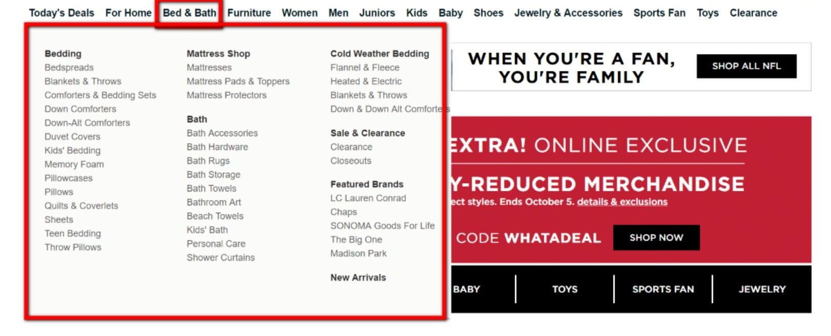
While we’re talking about the user experience, let’s talk about the elephant in the room: menus.
“Poor navigation is a problem for both desktop and mobile sites,” says Stickler. “A lot of desktop sites have huge complex menus with granular categories, which can be useful if you’re on desktop–but it’s a lot better to have a basic menu that opens up into more granular subcategories for both desktop and mobile.”
It’s so easy to leave the same menu that you’ve had since 2000 up simply out of fear that your users will be confused about where to go, or because you may lose some mystical SEO juice, but the truth is your customers may not even be using it.
If your menu is confusing, your customers will probably try to use the search bar instead (more on that next). And if they’re on mobile, and your site isn’t responsive, you can bet they won’t even be able to see the selections under each menu. They’ll most likely just leave.
“Keep in mind how people see your site, and make sure to do a lot of user testing,” says Stickler. “A common problem–if you’re the one working on your site–is you get overly familiar with the way it works, and you can’t see what’s wrong with it anymore. That’s why it’s important to test [the user experience] with an outside user. A lot of companies don’t test their site with outside users, and that’s a big mistake.”
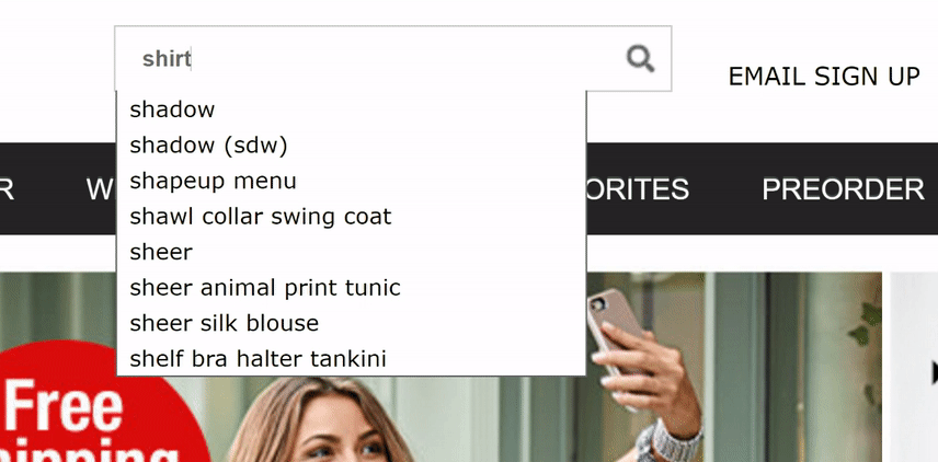
Remember those users who were frustrated by your menu and couldn’t find that sweater they wanted to buy? Well, they’re about to turn to your search bar. And if your search bar isn’t functional, it could pose some big problems.
Let’s say your customer is searching for a “black sweater” for his wife. What if your search bar is set to exactly match a user query?
“[A lot of search bars] are set up as “exact match” for a product,” Stickler explains. “If it’s a clothing retailer, and you don’t have a product specifically named “black sweater” and someone searches for [sweaters], then it may not show up. You don’t want people to think you don’t have things that you do.”
Well, first, do you actually need a search bar? Not necessarily.
“A lot of people see that as something you have to have. Those are really useful if they’re set up well, but if they’re set up poorly, it can damage the experience and take people away.”
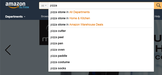
If you must have a search bar, invest in a better design—one that auto-suggests the right kinds of products (unlike the example above) similar to Amazon’s below:
Today’s shoppers are much too impatient to wait around for a slow-loading ecommerce site.
If you’re not sure where your site stands on speed, start by looking at your score on Google’s Page Speed Insights.
We did a search on a well-known retailer’s website, and this is what we found:
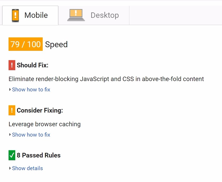
The best part is that Google shows you what you can adjust to potentially reach a perfect score of 100 for site speed on both mobile and desktop.
Slow ecommerce sites lose out on conversions.
Not convinced it’s an issue for your ecommerce site?
These Kissmetrics stats show the connection between conversion rate and site speed:
That says it all. Here’s how to fix the issue.
Well, for ecommerce sites, a common problem is image size, according to Stickler.
“Product images that are thousands of pixels will also slow down your site, especially if people are clicking from product page to product page,” Stickler explains. “Your images should be large enough to show product detail, but not so large that they slow down your site.”
Another important thing to do to speed up your site? Eliminate extras.
“Make sure you’re not weighing down your site with a lot of JavaScript. Get rid of anything that’s unnecessary—a few years ago people were really into flashy website design with a lot of [additional design features], but that can slow it down,” says Stickler.
Oh—and remember the task before where we mentioned the importance of optimizing your site for mobile? It will have a positive impact on your speed.
All of the changes above should—on their own—have a positive impact on your user site experience, if not conversions. But when you put them together, you generate positive changes that will most certainly change user opinions of your site, and could be a long-term play for better sales.
Looking for a best practices guide that will help you take your site to the next level? Download our free guide:
https://tinuiti.com/blog/e-commerce-guide-conversion-rate-optimization/